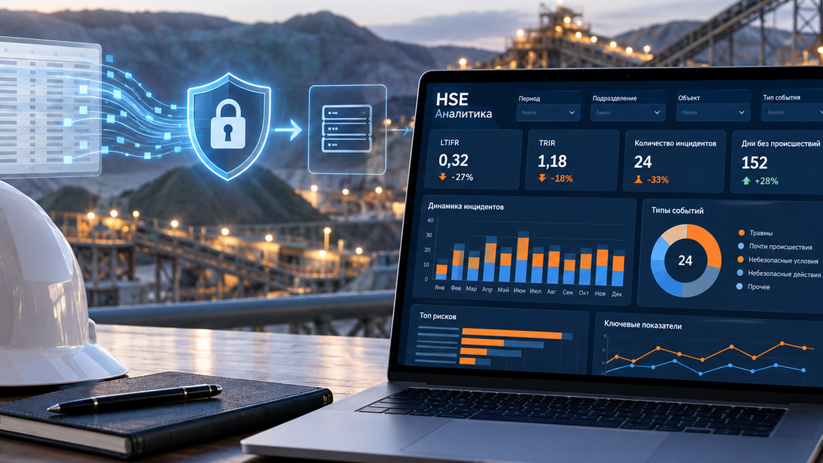
From an anonymized Excel file to management-level HSE analytics. Stage 2: building a standalone interactive HSE dashboard with vibe coding
AI helps to build the software shell on an anonymized Excel template, while the real working database is loaded into the finished HTML locally, on the user’s own computer.
Introduction
In the first article I showed how we solved the question of preparing data safely: we built a local masking tool and learned how to obtain an anonymized Excel template that keeps the structure of the working database without passing real personal data to an external AI environment.
The next question comes almost immediately: what do you do with that template next?
Our task was not simply to build a few charts. We needed a working analytical tool that could be used when preparing cascade communications and safety committees: change the selection, drill down from a general indicator to a unit, a section and an individual record, see the bottlenecks and quickly prepare material for a conversation with managers.
At the same time the main condition of the first stage still held: during external development the real working database of the company is not passed to the AI.
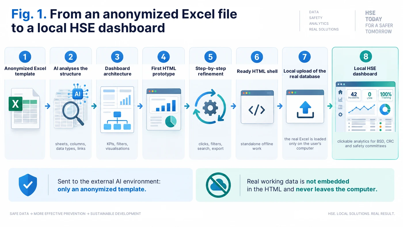
Why we needed a dashboard of our own
Our source data has been generated digitally for a long time. Managers and specialists carry out behavioural safety dialogues (BSD) and critical risk control (CRC) through the corporate mobile application CoLab. So the problem was not a lack of data, but the next step — how to turn a large array of records into clear management analytics quickly.
The corporate system makes it possible to carry out an observation, fill in the fields and generate an export. Deeper analytical development, however, requires separate IT work. With a limited number of specialists, deadlines and funding, such requests can wait quite a long time.
The first online dashboards built on Superset cover basic quantitative tasks. For practical work that is not enough. When a manager sees that 500 checks were carried out or 70 deviations were found, the next question is always the same: where exactly did this happen, why, and which specific records are behind it?
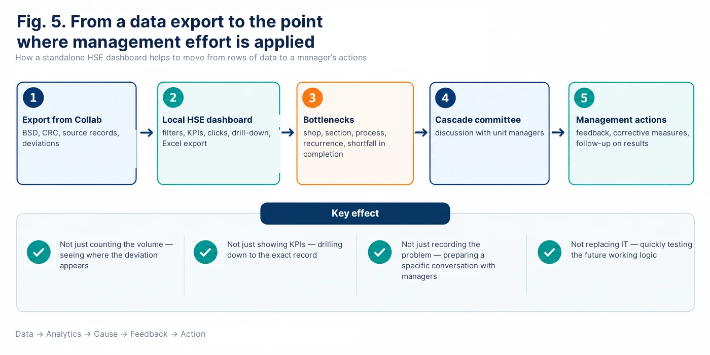
That is why we treat a standalone HTML dashboard not as a replacement for corporate IT systems, but as a fast interim tool. It allows you to test analytics in practice within a short time, to understand which indicators are really needed and where drill-down to primary data is required — and only then to write a more precise specification for an industrial implementation.
Step 1. First understand the data, do not write the program
One of the most common mistakes when working with AI is to ask straight away: “Build me a dashboard.” You can get a nice picture quickly, but it is far from certain that anyone will be able to use it afterwards.
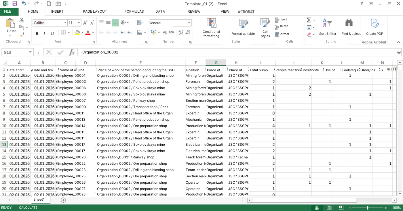
So our first request to the AI was a different one. We uploaded the anonymized Excel template and asked it not to program anything yet, but to examine the structure of the file: which sheets, columns and data types it contains, which fields are linked to each other, what can be used in filters, which indicators can be calculated and where the source structure may contain errors.
In this way the AI acts first as a data analyst, not as a programmer.
For behavioural safety dialogues, for example, the important fields are the date, the company, the shop, the section, the observer, the employee, the type of behaviour, the process, the description and the outcome. Instead of a real surname the AI may see “Employee_00001”. It does not need the real surname to build the logic of the dashboard.
Prompt 1 — analysis of the structure of the anonymized database: see the appendix at the end of the article.
Behavioural safety dialogues: from a general figure to a specific record
The next stage is to define not a set of beautiful visualisations, but the management questions the dashboard has to answer.
For behavioural dialogues we need to see the dynamics, the structure of the behaviour that was observed, the units, the processes, the recurrence of deviations, the work of the observers, and the ability to move from a general figure to a specific record.
The logic is therefore built top-down: company → shop → section → type of behaviour → process → individual record. Clicking a bar or a segment of a chart changes the selection and lets you see exactly the records that produced the indicator.
Separately we add a search by employee or anonymized identifier, the history of the deviations found, a ranking of units and of the people conducting BSDs, and an export of the current selection to Excel.
Here I use a simple rule: if after looking at a chart it is not clear which management decision it helps to take, then most likely that chart does not belong in the dashboard.
Prompt 2 and Prompt 5 — the structure of the HSE dashboard and interactive drill-down: see the appendix at the end of the article.
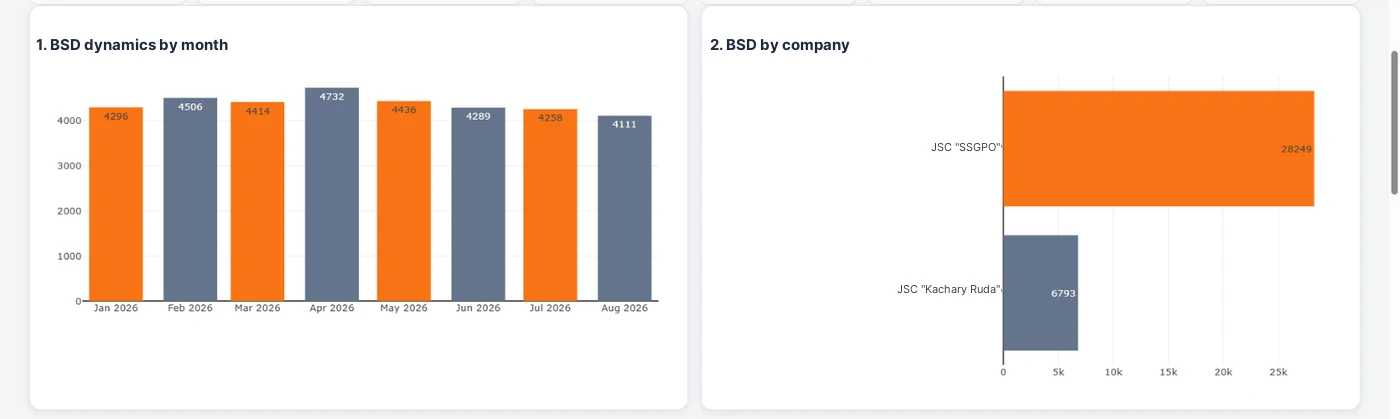
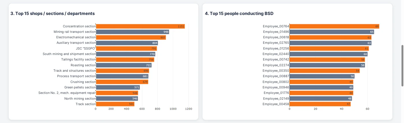
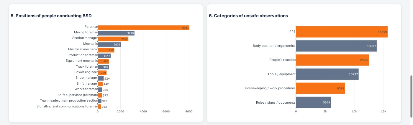
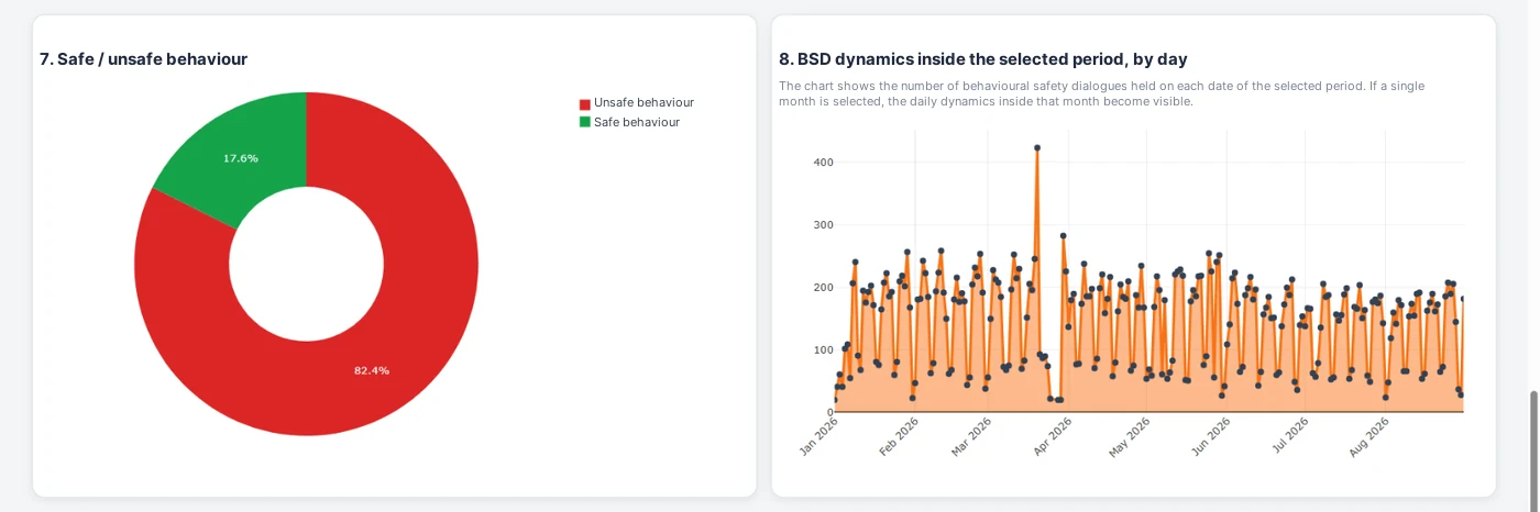
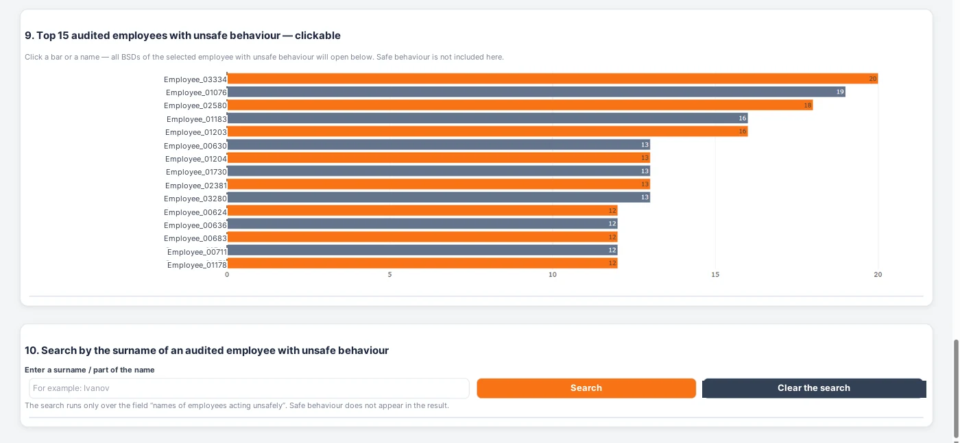
Adding the timesheet: how to see the established recommended frequency of BSDs
Then we went one step further. To save time and avoid building a separate tool, the same dashboard was supplemented with the attendance timesheet.
For development we first used an anonymized timesheet template, and later — locally — the actual timesheet. This made it possible to see not only the number of BSDs carried out, but also compliance with the established recommended frequency.
In essence we compared the number of shifts actually worked with the number of safety dialogues actually held. As a result it became visible where the required frequency is observed and where a backlog appears.
This approach is especially useful for shop and section managers: the dashboard shows not just the overall volume of work, but the real completeness of meeting the requirement, with drill-down to the unit, the occupation and the individual employee.
This addition did not require a new principle. We simply developed the logic we already had and connected one more array of data.
Prompt 6 — analysis of BSDs taking into account the shifts actually worked: see the appendix at the end of the article.
CRC: the same approach, but for critical risk control
The same logic applies to CRC. From the source export you can see how many CRC checks were carried out and how many of them contained deviations. But the gross number by itself does not answer the main question: to what extent is the requirement really met in every shift.
For this, the CRC data and the actual timesheet for the same period are loaded into the dashboard locally. After matching them you can see who was actually on shift, how many CRC checks they should have carried out and how many they actually did.
As a result we get not only the quantity, but also the completion rate, the shortfall, the list of those who did not complete their checks and — if an extended database is available — the link to the section, the shop, the process and the reasons for the deviations.
All the charts remain clickable: from a general indicator you can drill deeper — to the unit, then to the section, then to the occupation and finally to the card of a specific employee or a specific record.
I do not include CRC screenshots in this article so as not to overload the material. Technically the same principle is used as for BSDs.
Prompt 7 — CRC and the actual timesheet: calculating completion and drilling down to the employee: see the appendix at the end of the article.
Step 2. The first prototype and step-by-step refinement
Once the data structure and the logic of the analytics are clear, you can move on to vibe coding itself.
By then the task can be formulated quite specifically: create a single standalone HTML file that opens in an ordinary browser, contains KPIs, filters, interactive charts and a table of source records, and works without installing any separate software.
At this stage the program still uses anonymized data only.
The first version is almost never the final one. You select a company — and the list of shops stays general. You click a chart — and there is no drill-down to the record. You add a new function — and one of the visualisations stops working properly. This is a normal part of development.
Instead of rewriting the whole application, the task is set point by point: “Make the filters dependent”, “Add drill-down on click”, “Fix only chart No. 6, do not change the rest of the logic”.
This is exactly where vibe coding is particularly useful for a specialist who is not a programmer. You need to explain precisely not how to write a function, but how the program should behave for the user.
Prompt 3, Prompt 5 and Prompt 8 — creating the first HTML, drill-down and fixing defects: see the appendix at the end of the article.
Step 3. Removing the template and loading the real data locally
Once the interface and the logic have been worked out on the anonymized template, the demonstration data is removed from the final version. The HTML remains a software shell.
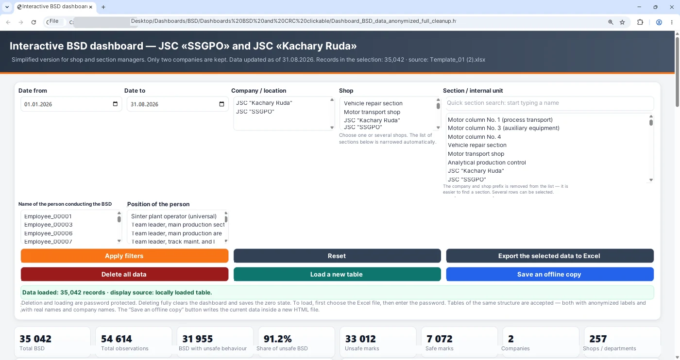
An Excel upload button is added to it. The user opens the finished HTML on a corporate computer, selects the current working database, and the browser then reads the file and calculates the indicators inside the local session.
So the final scheme is simple: the finished HTML and the working Excel file are on the same computer; the working data is loaded into the program locally and is no longer passed to an external AI environment.
In the screenshot published here the real surnames are masked. This matters: the article itself has to show the principle of the work, not disclose personal data.
Prompt 4 — local loading of the working Excel database: see the appendix at the end of the article.
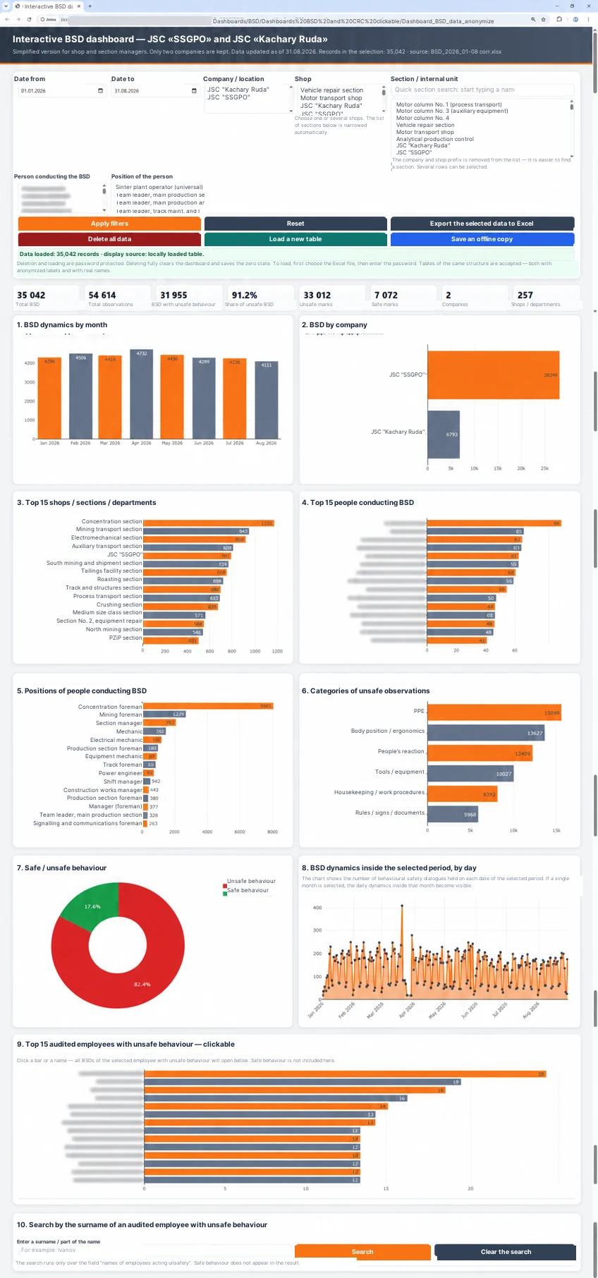
Loading, adding, resetting and the offline copy
User-facing functions required separate attention. In practice it is important not only to open the dashboard, but also to manage its state quickly.
So separate actions were added: loading a new table, deleting the data down to zero, saving an offline copy, and resetting the filters without deleting the database. These are different scenarios and they have to be clear to the user at first glance.
In addition, I recorded a short demonstration video that shows how the dashboard works on the anonymized template, how a full reset is performed and how the real data is then loaded. Such a video appendix answers questions faster than any text description.
Video appendix 1. Screen recording: from the template to the working database — the video is at the end of the article.
From analytics to the management conversation
The main value of the dashboard appears not on the screen, but in the meeting room.
The resulting views are used when preparing cascade communications and health and safety committees: from the level of units up to the central committee of the company, which is held monthly.
At section level you can see specific records and employees. At shop level — recurring problems. Higher up — compare units and highlight systemic areas that require the attention of managers.
As a result, what goes to the committee is no longer just the phrase “completion — 82%”, but a much more specific picture: which sections create the shortfall, in which shifts the requirement is not met, which types of deviations recur and which records have to be reviewed with the manager.
The dashboard shows where to look. The cause and the management decision are still determined by people.
A temporary tool or a future industrial system
For us a standalone HTML dashboard is not the final goal and does not compete with the corporate IT architecture.
Its task is to move quickly from a production idea to a working analytical prototype. While the industrial solution is being developed, units can already use the tool for analysis, and specialists get practical feedback about which indicators are really needed.
If the prototype has proved useful, its logic is far easier to hand over to IT developers for later implementation in JavaScript, in Superset or in another corporate environment with automatic data integration.
In other words, vibe coding does not replace IT. It removes part of the uncertainty before the big development even starts: it becomes clear in advance which filters are needed, where drill-down has to work, which data has to be linked and what management result the user should receive.
What we got in the end
As a result the anonymized Excel template becomes a technical bridge between the real working database and the AI. The AI sees the structure of the data, helps to develop the logic and the interface, writes and refines the program code. The real database appears in the tool only after the finished HTML is already on the user’s computer.
For a safety specialist this noticeably shortens the path from an idea to a working prototype.
The main advantage is not that AI can draw charts. The main thing is the ability to turn a production question into an analytical tool much faster, to see the bottleneck and to direct the manager’s attention to where action is really required.
In the next article I want to move from data analysis to another direction: to show how AI gradually turned from an ordinary assistant into a “second expert” that assesses the quality of safety briefings and behavioural dialogues against several independent criteria.
Ready-made prompts for building a standalone HSE dashboard for BSD and CRC
A practical rule: only a verified anonymized template is passed to the external AI environment. Real working Excel files, timesheets and personal data are connected later, locally, inside the finished HTML shell.
How the prompts relate to the article
| Section of the article | Prompt |
|---|---|
| Step 1. Analysis of the anonymized database | Prompt 1 |
| BSD architecture and management questions | Prompt 2 |
| Creating the first standalone HTML | Prompt 3 |
| Removing the template and loading the real database locally | Prompt 4 |
| Clickability, filters and drill-down to the record | Prompt 5 |
| BSD + timesheet: the established recommended frequency | Prompt 6 |
| CRC + timesheet: regularity of completion and deviations | Prompt 7 |
| Fixing defects and checking standalone operation | Prompt 8 |
Prompt 1. Analysis of the structure of the anonymized Excel file
I am uploading an anonymized Excel template of a working HSE database.

Do not program anything yet.

Analyse:
1. the sheets of the file;
2. the column headers;
3. the data types;
4. the mandatory and optional fields;
5. the hierarchical links between the company, the shop, the section and other levels;
6. the fields suitable for filtering;
7. the fields suitable for KPIs, rankings and visualisations;
8. the fields that can be used as a stable anonymized identifier of an employee;
9. potential problems of the source database: empty values, different spellings of the same unit, inconsistent date formats, duplicates, a mix of text and numbers, ambiguous column names.

For the BSD database, identify separately where the following are located:
- date and time;
- company;
- shop;
- section / internal unit;
- the person conducting the BSD;
- the position of that person;
- employee / anonymized identifier;
- type of safe or unsafe behaviour;
- process / type of work;
- description of the observation;
- outcome or reaction.

After the analysis:
- briefly describe the structure of the data;
- suggest which links between the fields have to be preserved;
- list the doubtful points that have to be confirmed with the user;
- only after confirmation, propose the architecture of the future dashboard.

Do not try to restore the anonymized values and do not draw conclusions about the identity of a specific employee.
Prompt 2. Dashboard architecture for behavioural safety dialogues
Based on the confirmed structure of the anonymized Excel file, propose the architecture of a standalone HSE dashboard for behavioural safety dialogues.

The main principle: every visualisation has to answer a specific management question. Do not add charts just for decoration.

Provide for:
1. key KPIs on the volume of BSDs and observations;
2. filters by period;
3. a dependent hierarchy company → shop → section / internal unit;
4. a filter by the person conducting the BSD;
5. a filter by the position of that person;
6. BSD dynamics by month and/or by day;
7. a comparison of companies;
8. a top list of units / sections;
9. a top list of people conducting BSDs;
10. the structure of safe and unsafe behaviour;
11. categories of unsafe observations;
12. analysis of processes / types of work;
13. a ranking of employees whose unsafe behaviour was recorded more than once;
14. a search by employee or anonymized identifier;
15. the BSD history of the selected employee;
16. the ability to see whether the same type of unsafe behaviour recurred for the same employee on different dates, with different managers or in different sections;
17. an export of the current selection to Excel.

For each visualisation state separately:
- which question of a manager it answers;
- which fields are used;
- where a click on an element of the chart should lead.

First describe the architecture in words. Do not produce code yet.
Prompt 3. Creating the first standalone HTML
Based on the agreed architecture, create the first standalone version of the interactive HSE dashboard.

Requirements:
1. The result is a single HTML file.
2. The file opens in an ordinary browser without installing additional software.
3. At the development stage use anonymized demonstration data only.
4. Add the agreed KPIs, filters, rankings, search, interactive charts and a table of source records.
5. Do not use a backend.
6. Do not use external APIs.
7. Do not load libraries from a CDN.
8. All the required libraries have to be inside the HTML file.
9. The dashboard has to open and work fully with the internet switched off.
10. Do not add telemetry, visit analytics or network requests.
11. Organise the code so that the demonstration array can later be removed and a real Excel file connected locally.
12. Do not change the existing anonymized employee identifiers unless necessary.

After creating it:
- list the functions that have been implemented;
- list the limitations of the first version;
- state which functions have to be checked manually before further refinement.
Prompt 4. Local loading of the working database, reset and offline copy
Refine the existing standalone HSE dashboard.

Goal: once development is finished, the demonstration data has to be removed from the HTML, and the real working database has to be connected only locally, on the user’s computer.

Add the following functions.

1. “Load a new table”
- the user selects an Excel file on their own computer;
- the file is read by the browser locally only;
- the data is loaded into the memory of the current session;
- the KPIs, filters, charts, rankings and tables are fully rebuilt;
- the structure is determined by the column headers, not by fixed column numbers;
- if a mandatory field is missing, a clear error message is shown.

2. “Apply filters”
- recalculate all visualisations for the current selection.

3. “Reset”
- clear only the selected filters;
- return the view of the whole loaded database;
- do not delete the data itself.

4. “Delete all data down to zero”
- completely remove the loaded working array from the current state of the application;
- clear the KPIs, charts, rankings, tables, names / identifiers and filter lists;
- return the HTML to the state of an empty software shell.

5. “Export the selected data to Excel”
- export only the currently filtered selection.

6. “Save an offline copy”
- save only after an explicit action by the user;
- if the current working database is embedded into the copy, show a warning that the saved HTML contains working data and has to be stored as a confidential file;
- no information may be sent over the network while saving.

If a function for adding new data is introduced later:
- check the structure first;
- do not create duplicates automatically;
- show the user how many records will be added and how many will be rejected.

Remove the demonstration array from the final version completely.
Prompt 5. Dependent filters, clickability and drill-down to the record
Refine the existing HTML dashboard without rewriting it completely.

What is needed:
1. Make the filters dependent:
   company → shop → section / internal unit.
2. After a company is selected, keep only the shops that belong to it.
3. After a shop is selected, keep only its sections.
4. Take into account the selected period, the person conducting the BSD and their position.
5. Make the main charts and rankings clickable.
6. When a bar, a sector, a point, a ranking row or an employee is clicked, apply the corresponding selection to the whole dashboard.
7. Show the source records that produced the selected indicator.
8. Add the ability to go one level up or to reset the current drill-down.
9. Add a search by employee / anonymized identifier.
10. For the selected employee, show the BSD history for the selected period: dates, units, people who conducted the BSDs, types of behaviour, processes and source records.
11. Separately show the employees whose unsafe behaviour was recorded more than once.
12. Make it possible to see the recurrence of the same type of unsafe behaviour even if it was recorded by different managers or specialists and in different sections.
13. Export the current selection to Excel.
14. Do not change the functions that already work unless necessary.

After the refinement, run a regression check:
- all filters;
- clicks on the charts;
- search;
- drill-down;
- export;
- return to the full selection.
Prompt 6. BSD + actual timesheet: meeting the established recommended frequency
Add to the existing dashboard a mode for analysing BSDs that takes the shifts actually worked into account.

Sources:
- the BSD export from Collab;
- the working time timesheet for the same period.

At the development stage use an anonymized timesheet template only. The real timesheet has to be connected later, locally only.

IMPORTANT:
do not invent the standard for conducting BSDs yourself. Before the calculation, the user has to set the established recommended frequency, for example:
- X BSDs per N shifts actually worked;
- X BSDs per calendar / reporting period;
- another rule of the company.

Logic:
1. Determine the shifts actually worked from the timesheet.
2. Do not count leave, sick leave and other absences as shifts actually worked.
3. Match the BSD array and the timesheet by the stable employee identifier, company, shop, section, occupation and period — depending on the available fields.
4. Do not mix identical surnames / identifiers and occupations from different units.
5. Using the frequency set by the user, calculate the expected number of BSDs for the time actually worked.
6. Show:
   - the shifts actually worked;
   - the established recommended frequency;
   - the actual number of BSDs;
   - the deviation from the recommended frequency;
   - the completion rate;
   - the units and employees where a backlog exists.
7. Add drill-down:
   company → shop → section → occupation → individual employee → their BSD records.
8. Make it possible to export the list of employees / units with a deviation.

If the structure of the timesheet or the frequency rule is ambiguous, first show the doubtful cases and ask for confirmation. Do not run the calculation before confirmation.
Prompt 7. CRC + actual timesheet: regularity of completion and deviations
Add to the dashboard a separate mode for analysing critical risk control (CRC).

Sources:
- the CRC export from Collab;
- the actual working time timesheet for the same period.

At the development stage use anonymized templates. Real arrays have to be connected locally only.

Logic:
1. Determine the shifts actually worked by each employee.
2. Do not count leave, sick leave and other absences as working shifts.
3. Do not invent the standard / required regularity of CRC yourself. Obtain it from the user as a parameter.
4. If the requirement “1 CRC per shift actually worked” has been confirmed for a specific process, use it only after the user confirms it.
5. Match the CRC records with the shifts actually worked by the stable identifier, company, shop, section, occupation, date and/or shift.
6. Do not mix identical occupations and identifiers from different units.
7. For each employee show:
   - the shifts actually worked;
   - the number of CRC checks;
   - the shifts / periods where a CRC check is missing relative to the given rule;
   - the deviation;
   - the completion rate.
8. Add drill-down:
   company → shop → section → occupation → employee → a specific shift / a specific CRC record.
9. Make it possible to export the list of employees or shifts with a deviation.
10. If the CRC export contains identified hazards, critical risks, descriptions of deviations or causes, additionally show:
   - recurrence by section;
   - recurrence by process;
   - recurrence by employee;
   - the source records on click.

If the structure of the data is ambiguous, first show the matching rules and the doubtful cases. Do not run the final calculation before the user confirms them.
Prompt 8. Diagnosing defects and a technical self-check
Run a check of the existing standalone HTML dashboard.

Do not rewrite the whole application first.

If an error appeared after the latest refinement:
1. Find the specific cause.
2. Fix only the part that needs fixing.
3. Do not delete or rewrite the functions that already work without a reason.
4. After the fix, run a regression check.

Be sure to check the following scenarios:
- opening the HTML with no internet connection;
- loading an anonymized test Excel file;
- dependent filters;
- clicks and drill-down;
- search by employee;
- export of the selected data;
- resetting the filters;
- full deletion of the data;
- loading a different table again;
- saving an offline copy.

After the functional check, run an audit of standalone operation and of possible transmission / storage channels:
- fetch;
- XMLHttpRequest;
- WebSocket;
- EventSource;
- sendBeacon;
- external script src;
- CDN;
- external CSS and fonts;
- APIs;
- iframe;
- Service Worker;
- localStorage;
- sessionStorage;
- IndexedDB;
- cookies;
- telemetry and analytics.

The final version has to:
- work fully with the internet switched off;
- not send the contents of the loaded Excel files over the network;
- not save the working database covertly without an explicit action by the user;
- remove the working data from the current state of the interface on a full reset.

At the end, give a short report:
1. what has been checked;
2. which defects were found;
3. what has been fixed;
4. which limitations or risks remain.
Recommended order of use
- Run Prompt 1 and check whether the AI understood the structure of the anonymized Excel file correctly.
- After the structure is confirmed, run Prompt 2.
- Run Prompt 3 and get the first standalone HTML version.
- As the work progresses, use Prompt 5 for filters, clicks and drill-down.
- When the logic is ready, run Prompt 4: remove the demonstration data and set up local loading of the working database, resets, export and the offline copy.
- If an analysis of the recommended BSD frequency is required, connect Prompt 6.
- For CRC and the comparison with the actual timesheet, use Prompt 7.
- After major changes and before publishing / handing the tool over to users, run Prompt 8.